Cloud Dancer: Pantone Color of the Year
- Camila Battiato
- Jan 24
- 3 min read

“Wait… what?”
That was my very first reaction when I saw the Color of the Year.
After the past few years, and especially this last one, we’ve all been leaning more into color. Braver interiors, richer palettes, moodier spaces. Not just in design, but in fashion too. Color feels expressive, personal, alive.
So when Cloud Dancer, a soft white, was announced, my initial thought was honestly: this feels off.
At first glance, it felt like a step backward. Too safe. Too neutral. Almost out of sync with where creativity has been heading lately.
But then something interesting happened.
I took some time off. I read posts, opinions, and conversations online. I listened to what people were saying about it. And slowly, I started forming a more critical and thoughtful perspective on this choice.
Why White Is Never Really “Just White”


White is everywhere.
It’s what we reach for when we want to play it safe. When we want calm. When we want clarity.
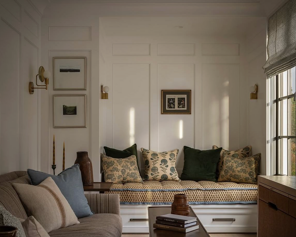
I recently moved, and my new home is entirely painted white. It’s a small space, and from the very first moment, I knew why it made sense. White visually expands rooms. It reflects light. It creates breathing room.
Normally, my interior style leans more colorful and a bit moody. I love depth, contrast, and character. So my first instinct was, I’ll change this later.
But then I paused and asked myself:
Why not leave it as it is and build on top of it?
(Even though… let’s be honest, I might still change something later. Wallpaper, painted walls, color moments… who knows?)
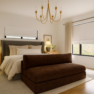
Instead of changing the walls, I started thinking about elevating the white with furniture. Playing with contrast. Letting my personality come through patterns, textures, shapes, and materials while keeping the base neutral.
That’s when Cloud Dancer came back into my mind.
A White That Invites Creativity
The more I sat with it, the more it made sense.
Yes, Cloud Dancer is simple.
Yes, it’s widely used.
And yes, it rarely fails.
But maybe that’s exactly the point.
This year, white can be the canvas again. The starting point. The base that allows you to take risks elsewhere. Color doesn’t disappear. It just moves to different layers of the space.
Via Camila Interiors
According to Pantone, Cloud Dancer represents ease, softness, and quiet confidence. And I kind of love the idea that they’re saying: Here’s the base. Now do whatever you want with it.
Because that’s how we often design anyway.
We paint everything white… and then we see.
We buy a white sweater or a white pair of jeans because it goes with everything.
We start neutral, then layer personality.
And let’s not forget: white is never just one color. There are endless undertones. Warm whites, cool whites, creamy whites, crisp whites. Cloud Dancer is just one option among thousands.
So… Was It the Wrong Choice?
After really sitting with it, I don’t think so.
Is it bold? No.
Is it timeless? Absolutely.
Is it safe? Yes, and that’s not always a bad thing.
Cloud Dancer feels like permission. A reminder that white doesn’t mean boring. It means flexible. It means intentional. It means letting color, texture, and form speak louder.
And honestly? Once I digested the idea, it didn’t feel so wrong anymore.
What Do You Think?
Do you see Cloud Dancer as uninspiring
or as a fresh base for creativity?
I’d love to hear your thoughts!
Work with me: https://camilainteriors.setmore.com
Email: camila@camila-interiors.com
Instagram: https://www.instagram.com/camila.interiors
Youtube Channel: https://www.youtube.com/@Camila.Interiors


Comments